Monday, 30 April 2012
My Brief.
After talking to a peer today about the brief I was going to tackle, I
realised that I am essentially going to be re-branding 17 cosmetics
range. However, I am mostly unsure on the target audience that 17 are
aimed at as I want my design to be a little more mature. Consequently, I
am thinking that I could use the concept of the 17 brand and the
problems associated with their brand but find a new target audience in
which I am going to brand the range to. I want my designs to have a
strong hold on the design of the product, this will allow me to bring
some elements of successful design driven prints I see into my work. I
am not yet sure what this target audience could be, so I am going to
have a little think.....
Sunday, 29 April 2012
Re-Writing the Brief
Today, I was re-considering the brief I had originally written for this project as it was very vague and I was not sure/was very vague about what the content of my brief actually was.
I had become unsure as to whether I wanted to stick solely to the 17 brief or whether I wanted to use the essence of that brief but to brand a different product. It was the fact that the 17 brief would allow me to explore retail graphics which I liked, but I realised that this did not mean that I then had to actually rebrand 17. I have never worked on a retail graphics inclined brief but whenever I see edgy retail graphic I feel inspired. However, because I have not had the chance to work on one myself I am not sure whether I will actually enjoy working on a retail graphics. As a result, I have decided that I am going to work on the 17 brief and see if I enjoy the process and outcomes, this will then inform me as to whether or not I should tackle these type of briefs next year and will ensure I use my time effectively next year.
I first listed what it was about the 17 brief that made me want to tackle it and then began considering other products I could use instead...
After this process, I decided that it actually may be quite fun to re-design a make up brand as I myself use it and can relate to the target audience. So I began to look at where no17 stands as a brand....
On the basis of this, I then re-wrote the brief....
Thursday, 26 April 2012
Wednesday, 25 April 2012
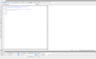
Dreamweaver Workshop2
//What did we determine had to be identified and analysed before designing our website?
Audience, purpose
//Limitations of web?
Typeface, colour, resolution, space
Dreamweaver uses HTML.
HTML tags:
'html' ...open html (this point onwards going to be talking in html.)
'/' ...close (end of whats been going on)
'/html' ...end of html
anything that goes in between is visible.
/body
title- put the title between the two tags
/title
head ...anything in between the head tags isn't visible but helps the design of the website
/head
Correct tag order:
<html>
<head>
</head>
<body>
</body>
</html>
can create a website using just these tags.
everything must be spelt correctly in order for it to work.
work in lower case ..avoid spaces and number
//exploring web source codes...
//first create a route folder
//3 views...
//Direct Dreamweaver to root folder...
//To link Dreamweaver to website
//SAVE
Automatically saves into root folder.
Needs to be called 'index' (all in lower case)
//Preview...
//Change name on toolbar
//Add body...
Link style sheet to html...
//other changes:
//Dividing the website
have to do positioning a float when dividing the page.
'float left/right'
DIV ID for navigation...
align each div with its close div.
//Adding an image
make image as small as possible.
do not put a solid background colour in the design, specify this is the CSS.
//embed
//file save all
//drag onto desktop DO NOT LEAVE IN USER WORK AREA.
Bring scamp of design want to create for next week.
Audience, purpose
//Limitations of web?
Typeface, colour, resolution, space
Dreamweaver uses HTML.
HTML tags:
'html' ...open html (this point onwards going to be talking in html.)
'/' ...close (end of whats been going on)
'/html' ...end of html
anything that goes in between is visible.
/body
title- put the title between the two tags
/title
head ...anything in between the head tags isn't visible but helps the design of the website
/head
Correct tag order:
<html>
<head>
<title>
</title>
</head>
<body>
</body>
</html>
can create a website using just these tags.
everything must be spelt correctly in order for it to work.
work in lower case ..avoid spaces and number
//exploring web source codes...
'...!' ..open/close html (different for different browsers)
'style'
'div' ...division/dividers
'ul' ..un-ordered list (drop down menu)
'script'//first create a route folder
A sub folder named 'images;
//3 views...
//Direct Dreamweaver to root folder...
//To link Dreamweaver to website
//Check it works
Automatically saves into root folder.
Needs to be called 'index' (all in lower case)
//Preview...
//Change name on toolbar
//Add body...
SAVE
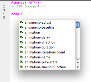
Always appears in times unless CSS added.
different coding language...
put each new attribute on a new line to make it easier to read.
SAVE as 'stylesheet'.
//other changes:
If reload page and it hasn't altered, need to refresh to load the new css.
alt 3 =#
...div ID.
//embedding the background into the html
//Dividing the website
have to do positioning a float when dividing the page.
'float left/right'
DIV ID for navigation...
align each div with its close div.
//Adding an image
make image as small as possible.
do not put a solid background colour in the design, specify this is the CSS.
//embed
//can make notes that won't affect website by pressing */
//file save all
//drag onto desktop DO NOT LEAVE IN USER WORK AREA.
Bring scamp of design want to create for next week.
Subscribe to:
Comments (Atom)


