BA (Hons.) GRAPHIC DESIGN | LEVEL | 05 | |
Module Code | OUGD201 | ||
Module Title | DESIGN PRODUCTION - PRINT | ||
END OF MODULE SELF-EVALUATION |
NAME | KIRSTY FRUIN | BLOG. ADDRESS |
1. What skills have you developed through this module and how effectively do you think you have applied them? | |||||
This module has provided me with more in-depth Illustrator and InDesign skills as I have forced myself to use these pieces of software for this exact purpose; I didn’t think my skills were at a high enough standard prior to this module and still have an awful lot to learn. I used Illustrator software to create my artwork and Issuu content and have used InDesign to produce my concept baords and develop my typography skills. I have developed skills in print production and now have a core understanding of the print processes available and how to prepare my artwork for commercial print. Now that I have this knowledge I can build upon it and use the techniques in a more creative manor. I have also learnt basic typography skills which I can, and have begun, to use this to inform my design design decisions; how you present type can truly adjust the way in which informatin is portrayed. | |||||
2. What approaches to/methods of design production have you developed and how have they informed your design development process? | |||||
In putting together my Issuu document and preparing my artwork for commercial print, I have realised the sheer amount of information I have learnt in this module. I have now begun to consider these techniques and the printing options available to me right from the very offset. When I now produce my initial designs for my product I annotate my designs with proposed print processes and stock options I could use, this then determines the document setup and colour palette I use when I get onto the computer to design digitally; for example, if I am designing for digital print I will need to ensure that my document is set up in cmyk colour mode and that I do not use any spot colours. Once I have designed my artwork I am then required to provide the necessary information to the printers; this is done through the notes attached to the pdf, named swatches used for specific print processes and the incorporation of printers marks. All in all, I take a more informed approach to designing my artwork and take into account a lot more print considerations. | |||||
3. What strengths can you identify in your work and how have/will you capitalise on these? | |||||
The work I produce is very informed and conceptualised; I prefer to design on a brief which has a clear target audience, tone of voice and context in which it will be seen in. In ensuring this I feel the work I produce is more ‘live’ and ‘real’ in the world, therefore having more meaning. I want to continue this throughout my designs, to do this I will ensure I write regular rationals outlining the above information. My design work has become more considered and structured, this is due to me taking a lot more design decisions into consideration when designing my artwork; such as type, grid, layout, colour, stock and print processes. I will continue to do this in more depth in order to further inform my design outcomes. I have made a conscious effort to time plan on a regular basis, this is to ensure I utilise the time available to me and get the tasks done which are necessary to my development. I will continue to post these to-do lists and time plans to my blog. I also strove to include primary research into this module as this is one area which has been lacking in previous modules. I will continue to do this as I have realised how much design is out in the real world and how the smallest design decision can influence your own design. I have begun to ask for help when I need it now and will definitely continue to do so; I have realised the tutors in and aound college are here to help, no matter how small a problem may seem. This has helped me especially when it comes to working digitally on the macs. | |||||
4. What weaknesses can you identify in your work and how will you address these in the future? | |||||
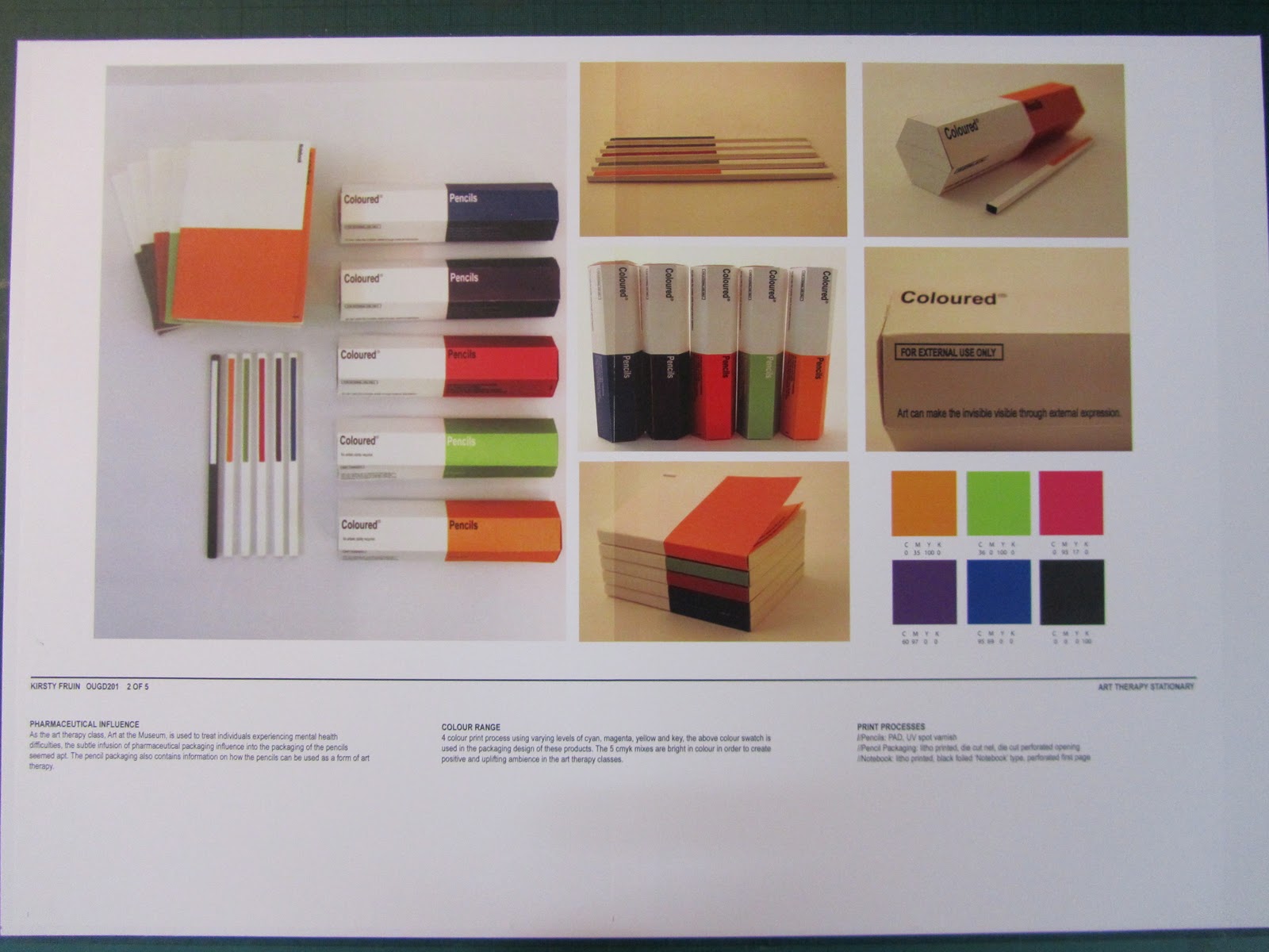
I need to be more creative with the design choices I make as I feel I stayed quite safe with the packaging and promotional material I both produced and propsed. I did not explore as many printing processes as I could have; I mainly proposed to use litho print, die cut and foil blocking. I need to ‘think big’ and explore areas unknown to me as this is the only way I am truly going to be able to further my creativity within my designs. I also need to push my designs forward into multiple areas and consider applications of my designs other than the obvious. I need to work at a consistent pace from the onset of the brief; I found that I was working at a steady pace throughout the module, however, when it came to the final crit I rapidly became stressed in realising how little printed matter I had. I think this may have been to do with the fact that we had so long working on this brief that I became comfortable at desiging on paper and not getting my designs into digital format. Nevertheless, this then caused me to power on and work flat out for the week following which took it’s toll and caused me to produce some designs which I am less than happy with (poster and handout). To ensure this does not re-occur in the future I will utilise the time available to us with our tutors, as I can then ensure I am on track with the work I am producing. | |||||
5. Identify five things that you will do differently next time and what do you expect to gain from doing these? | |||||
1//Engage with tutors on a regular basis to ensure I am working on track, this will ensure I do not have to rush any of my designs and produce at the highest quality I possibly can. 2//Be more creative with my design decisions; by taking into consideration how I can creatively use the print processes available to me, my designs will be enhanced and have a greater effect on my audience. 3//Attend all visiting professional talks that I can; I find these really motivate me and give me an insight in the real working graphic design world. This motivated attitude will help me produce more work and seeing the professionals work will allow me to envisage how I see myself as a designer. 4//Pay that little bit more and print my concept boards in the digital dungeon. I made the mistake of not doing this and just printing them on two A3 sheets in the mac suites. However, this was extremely time consuming and did not provide me with the quality of print you can achieve in the dungeon. In printing in the digital dungeon, my concept boards will be of a higher quality and I will not be wasting time printing and aligning boards in the mac suites. Time is of the essence! 5//Use Issuu to document on my blog. I did try to do this but I faced problems with the file size. However, if I am able to rectify this problem it will result in my blog being a lot tidier and easier for navigate. | |||||
6.How would you grade yourself on the following areas: (please indicate using an ‘x’) 5= excellent, 4 = very good, 3 = good, 2 = average, 1 = poor | |||||
1 | 2 | 3 | 4 | 5 | |
Attendance | x | ||||
Punctuality | x | ||||
Motivation | x | ||||
Commitment | x | ||||
Quantity of work produced | x | ||||
Quality of work produced | x | ||||
Contribution to the group | |||||
The evaluation of your work is an important part of the assessment criteria and represents a percentage of the overall grade. It is essential that you give yourself enough time to complete your written evaluation fully and with appropriate depth and level of self-reflection. If you have any questions relating to the self evaluation process speak to a member of staff as soon as possible. | |||||