Monday, 30 January 2012

Artwork for Title Sequence

I have just produced the artwork for the latter part of my title sequence. Again I have taken inspiration form Ministry of Sound 'The Annual 2010' album artwork as I want my title sequence to take on the artwork of the album covers rather than including the album covers as an object themselves...


I have mainly used the layout; the position of type and the use of lines to then convey my own message to my audience....


This is the original plan for the composition of my title sequence artwork. I think I want to then place the logo in the top left hand corner (although I am not 100% sure on this and the black triangle). All the layers of type are visible at the moment. However, each piece of type is on a separate layer to allow each piece of type to be individually transformed in AfterEffects. This will be placed upon a gradient to enhance the MoS vibe.

I think could look effective if the right transitions are applied and remain in time to the beat of the audio.

I then realised that it will be easier if each piece of text is presented in a different composition (to make my main composition less cluttered and more organised) so I set about positioning the artwork in separate documents with each piece of type on a separate layer....


...I put the ministry of sound type with each letter on a separate layer as it is going to be necessary in order to produce some of the effects I have storyboarded for my title sequence.


...now to get these into AfterEffects and get moving these graphics.


Ident5

I have just completed a fifth ident as I felt my first ident did not quite showcase my abilities on After Effects (not that I am amazing... but I have definitely progressed and learnt many new skills throughout the workshop over the past few weeks)
So here is my completed 5th ident (to replace the basic number1) ......


After Thoughts on the Ident Production

From completing these idents today and looking at some fresh inspiration, I have realised how many of my idents could be improved, with the subtle introduction of new elements or tweaking of existing ones. I don't have enough time at the moment to go back and adapt them all now. So my plan is to incorporate these elements into my title sequence, then go back and add these into my idents if I have time. But here are the rough idents I have produced (for now)


Saturday, 28 January 2012

Possible Net Designs

I have been considering the design of my CD packaging and used the net books from the studio to find some net designs which could possibly be suitable to use as packaging for my CD, popped them onto my mac ...and away we go!


After Effects Time!

Popped into college today to get a bit of motion in my graphics! I had an idea in my head for the 'X's' on this design to roll off to the side, however when I tried it this is what happened (not sure whats going on with the first gradient either)...


Definitely not the look I was going for! So I have scrapped that idea as I think an upward wipe out would work considerably better.....


Still not quite up to scratch but the general execution of motion is a lot better than before!

I have decided my first ident is not hitting the mark, in terms of showing the skills I have learnt in AfterEffects (probably because my skills are developing continually) so I have decided to create a 5th ident! Using the notion of one of my top10 album artworks, this is what I have produced to open the sequence.....


I may have to adjust the audio a little as I think it goes into the beat of the sound a little too quick.

Friday, 27 January 2012

AfterEffects Progress


...colour coding my layers for quick knowledge of whats what.


Looks simply, but this is the work that went into it......


Thursday, 26 January 2012

Type Workshop3

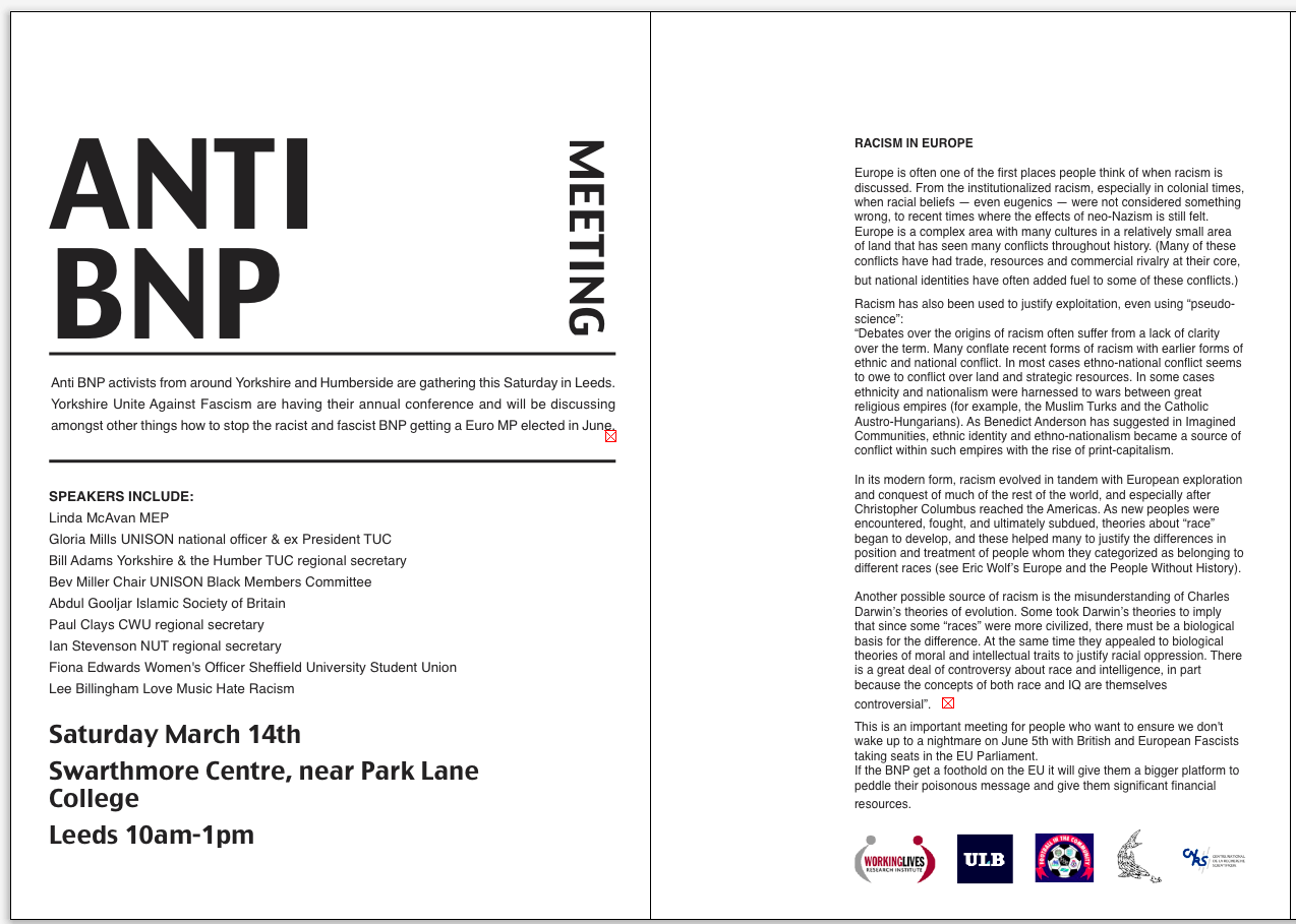
Info for double sided A5 flyer...


Too much type.

Hierarchy..1
//people understand quickly
2//worth considering to read later on

2 Sides ...what goes on each side.


ANTI BNP is more important as a headline.
Allows people to automatically associate it with racism, so no need to emphasis it further.

/REMEMBER...set margins when open work

CMD + SHIFT = change size of image


Grahams feedback... the date etc WAY too space. Too many words per line in text after BNP. Good use of white space.


LOGO... make all a similar  visual size
this makes them less interesting and less busy
do this rather than aligning them all to the same height
then group them in a box with a weight around them.
the black frame neutralises the space. gives you a geometric form.


Task//Collect leaflets ...menus etc