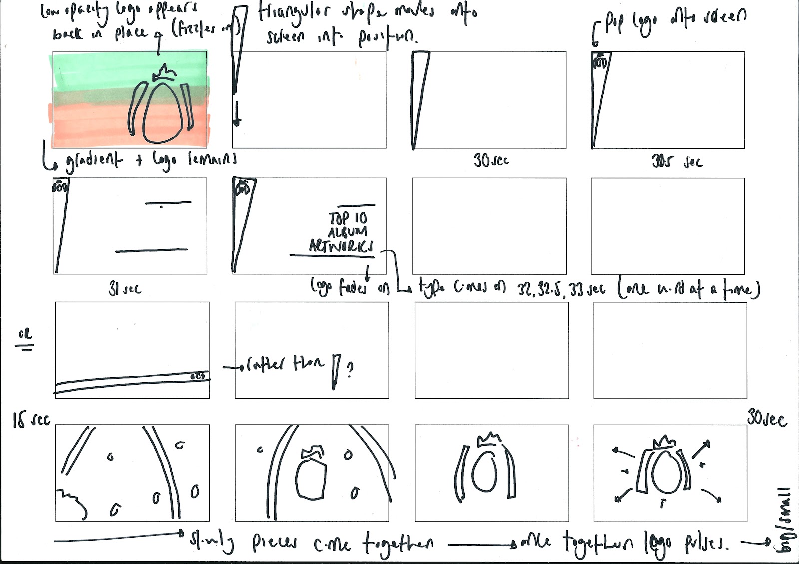
These are my storyboards for my Idents. They have the times written to the right hand side of each frame, however, I am going to put each potential sequence onto a timeline to allow me to see how the graphics are going to work in relation to time.
I have begun to work on the beginning of my title sequence. I want the gradients to work in time to the music. Below is what I created, however, I think the colour of the gradients are not prominent enough and i don't like the transition between the gradients. So, I am going to make the 100% opacity keyframe last longer and reduce the opacity just before the next gradient occurs. This should make the colours more prominent and the transition between gradients smoother.
So far today, I have had a pretty slow start. I have realised the sheer importance of storyboarding! I had some simple ideas but nothing specifically aimed toward the production of my title sequence. Thus, I took the time this morning (after my 3D cube fail) to look at some more MoS ads and use the simple motions to inspire my sequence. This has helped me immensely and I know have a clearer idea of where to begin and where to take my sequence....
(the last 5 frames of this page)
(Whole page)
(Whole page)
(Whole page)
(Whole page)
Although this has no timings, it gives a general idea of my thought process and what visuals I want to try and achieve.
I am therefore going to print these off and timeline them to give an indication of time and pace within the motion graphics....
Due to me printing off the title sequences in black and white, it is not as clear as it could be with regards to the introduction of the coloured gradients. Nevertheless, this does give a clearer indication of the pace at which different transitions will/could occur within the title sequence (this is mainly down to the beat of the audio as my title sequence is very audio dependant).
I have begun to consider the design of my DVD cover. I want my DVD cover to be simple but convey the visual identity of my motion graphics, so I thought it would be apt to use a gradient and little text to convey my official 'top 10' title...
I have chosen to crack on with producing the sleeve with the gradient cards slotted into the sleeve and the cut out semi-circle; I feel this DVD packaging is the best representation of the work I have produced digitally.
After seeing the MoS logo album artwork, I decided I wanted to try and make a 3D square which could then rotate in order to reveal different information. I got Mike to help me but even he struggled! So i have attempted it but after a little while of slaving over it ...I have decided, I dont think my skills are at a high enough level to make this happen!!! This is what I got up to....
I tried to use this tutorial to help me, but it turns out it just creates a 2D object which looks 3D ...not what I wanted!!!!
These are storyboards I have created to follow when I get designing on AfterEffects. I haven given an indication of time to the right hand corner of each frame, however, I want to give a clearer indication of pace throughout these so I am going to place these frames for the idents on a timeline. I have also indicated the movements to take place via my annotations.
Monday morning and I need to sort my life out for the week! So I thought it be best if firstly I set to writing a to do list then, from that, creating a plan of action for the week (and a realistic one at that as I want to be able to stick to it and feel that I have achieved throughout the week!)