Tuesday, 24 April 2012
OUGD203 Part 2 Rationale
Today we had a workshop which, in the end, resulted in us producing a rationale outlining what we wanted to get from the next brief. I have realised the area of design that I want to begin to focus on and can now move forward in bringing briefs of interest to me together in order to allow me to work on one brief which incorporates all these areas of design. I think this may be fairly difficult to do as I am still interested in a fairly broad range of areas within graphic design, but I feel that with a little intuition I will be able to effectively do this. All in all, writing my own brief should provide me with the opportunity to work on design that I am truly interested in. Let the fun commence....
Analysing the Briefs
After Tuesdays session we were given the task of analysing the four briefs we had chosen to work with in order to produce our own brief. I annotated the briefs with five reasons why I chose them (what interested me) and then analysed them in relation to the list of assets I produced in my rationale.
In analysing the briefs in this way, it gave me the opportunity to truly see what each brief had to offer to me in fulfilling the rationale I had written. It also made me realise how most briefs will only fulfil certain criteria of my rationale, however, in order for my rationale to be fully fulfilled I would have to comprise my own brief. So that was my next task.
I found this rather tricky, I wasn't sure whether I should take one brief (so that I had an actual problem to solve) and then incorporate other elements from other briefs to then fulfil my rationale criteria, or whether to take parts from all the briefs and make a problem out of that. I thought the latter could become more confusing and not have context within the real world, so I chose to use the NO17 brief as the basis of my own brief but incorporate other aspects into this.
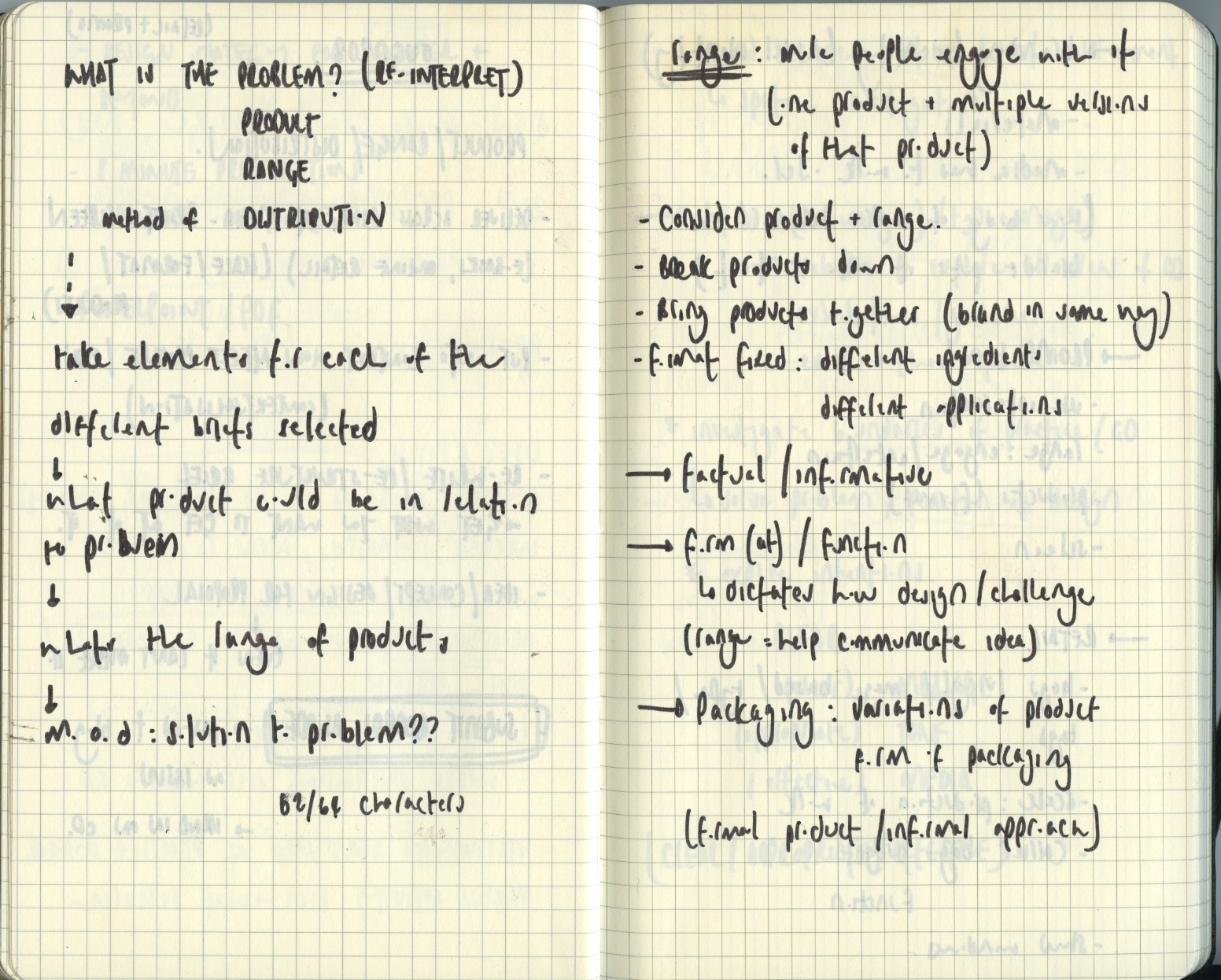
In order to ensure I was constructing a brief which met my rationale, I took one aspect from each and wrote it on a pink sticky note. I then proposed a brief which took all these aspects into consideration.
The brief I have produced is far too vague, but at this point I think having a vague idea is acceptable. We are having another session Thursday, so hopefully by then I will be able to consolidate my idea.
In analysing the briefs in this way, it gave me the opportunity to truly see what each brief had to offer to me in fulfilling the rationale I had written. It also made me realise how most briefs will only fulfil certain criteria of my rationale, however, in order for my rationale to be fully fulfilled I would have to comprise my own brief. So that was my next task.
I found this rather tricky, I wasn't sure whether I should take one brief (so that I had an actual problem to solve) and then incorporate other elements from other briefs to then fulfil my rationale criteria, or whether to take parts from all the briefs and make a problem out of that. I thought the latter could become more confusing and not have context within the real world, so I chose to use the NO17 brief as the basis of my own brief but incorporate other aspects into this.
In order to ensure I was constructing a brief which met my rationale, I took one aspect from each and wrote it on a pink sticky note. I then proposed a brief which took all these aspects into consideration.
The brief I have produced is far too vague, but at this point I think having a vague idea is acceptable. We are having another session Thursday, so hopefully by then I will be able to consolidate my idea.
Monday, 16 April 2012
Thursday, 29 March 2012
YCN Submission Confirmation
So today was the daunting day when we had to submit our final boards for Fedrigoni submission! After some last minute alterations, we were ready....
Done.
Done.
Wednesday, 28 March 2012
YCN//Final Edits
As a result of the feedback gained in our final crit, Liv and I went over our boards to make a few final edits before we submitted our boards.
The most integral criticism we wanted to rectify was make the background of our images entirely white so that it matched the colour of the stock. However, once we had done this and saved it again the quality of the images were not as good as before the editing. It also proved difficult to create the white background without effecting the image itself.
We tried various ways to create this white background....
-COLOUR PICKER TOOL AND BRUSH
-EDITING THE LEVELS
-LAYERING THE PHOTOGRAPHS ONTO A WHITE BACKDROP
-CUTTING THE BOOK OUT USING CUT TOOL
Nevertheless, the image was extremely pixelated when it was re-saved and positioned back onto the board...
We also needed to spellcheck our boards to rectify the spelling mistakes that had been noted to us during our final crit.
We also spent some time rectifying some of the more intricate details of the images (but ones that will make a big impact) ....
BEFORE
AFTER
this is the difference....
We then packaged our boards into a pdf zip file ready for submission...
We also ensured our file was named appropriately....
Dreamweaver Workshop
//Aims:
1. Identify purpose of website
2. Identify and distinguish the target audience
3. Identify and evaluate the target audience needs
4. Demonstrate understanding of interface design & basic layout techniques
//Purpose of a website:
Showcase portfolio
Practical
Self Promotion
Accessibility
Get a job
Freelance
//Target Audience:
Potential employers
Clients (type of work put on website will reflect the type of work you receive)
Collaborators
Like minded people
Awards
//Audience Needs:
/Potential Employers:
Contact information
Examples of work
Awards
CV
/Clients:
Reference/Reviews section
/Collaborators:
Links to their work
...these are therefore the pages we need.
(talk to potential target audience to find out what they want)
//look at similar websites (work out what works and what doesn't)
BROWSE THE INTERNET AND LOOK AT OTHER GRAPHIC DESIGN WEBSITES (good and bad)
Design the website and bounce ideas off peers
//WEBSITES
The average user will take 3-5 seconds to decide whether to move on or not.
WEB STANDARDS...Google W3
(bend these but still work)
Lightbox ...present videos
SCAMP: sketch of the web design layout
SITE MAP: shows all pages linking together
(produce both of these for next session)
WEB SAFE FONTS:
Specify a 'font family'.
The text on the website isn't embedded onto the computer, it uses whatever font is available on the machine accessing it.
(can make button as an image to use a non-web safe typeface)
Only a body copy using web safe fonts are searchable by a search engine (if left as an image it would be searchable)
WEB SAFE COLOURS: in photoshop tick 'only web colours' box on the colour picker. Use html code displayed #33333
800 x 600 will fit on any screen.
USE 1024 x 768
file: new: web: preset
(need to consider how it would fit on a tablet, phone etc)
Adobe flash does not work with any of Apple content.
Static Website: never updated
Dynamic website: updated (Facebook, blog)
...design of our website needs to be easy to update.
Can use dreamweaver to update the website (However, it costs a lot of money so a client probably wouldn't have it)
CMS: Content Management System
www.cushycms.com (simple to use and free)
instant dynamic content
http://www.awwwards.com/
YCN: Final Notes
I have been a little lapse on blogging my notes and time plans for the past couple of weeks. So here is my collection of notes...
Subscribe to:
Posts (Atom)