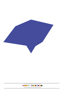
I carried on producing these minimalistic designs with the data blocks and profiles using solid blue, magenta and yellow as fills.
I experimented with the design layout of these data blocks; it's the little touches that count after all.
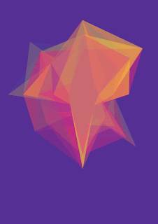
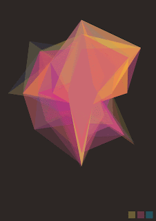
I wanted to display this layered star profile on it's own, so I experimented with different background colours to see what effect it had. I found that different colours enhanced different colours within the image but I feel the black background works the best at bringing out all the colours.
I incorporated these blocks at the bottom right hand corner to highlight the fact that the star shape is built up these three colours.
I used three lines instead of the three blocks to see the effects it had.
I created these two designs as possible cover designs as I have begun to consider transforming my 100 profiles into a book format.


No comments:
Post a Comment