Today was the day we had to get to it and the make the notebooks! As we could bind a thick enough book it the amount of time available to us we had use existing notebooks and cover them ourselves. It was heartbreaking but we found no other notebooks which use rounded corners so had to use a Moleskin and take it apart to then re-cover it with our own designs.
The books we managed to make were not a high a quality as we would have liked, however, with tactful photography and a little photoshopping we should be able to make them look presentable. After all, they are only a proposal for the real product to be made.

Monday, 19 March 2012

Sunday, 18 March 2012
Imagine Colour
I think this would still be an appropriate name for our colour picking
tool, as you imagine the colour at first and then see it applied to the
paper product. This then creates more of a focus on the quality of the stock they provide and then the colour element can come later (in the app and online creations).
Pushing our idea further....
Although Fedrigoni want to keep print alive and would prefer a non-digital media, I think it would beneficial to us to push our product into the digital as it is at the height of today's society. We will of course still send out our dairy and notepad to designers in order to give them something to physically handle (as this is what us designers love). However, we will propose to then create a colour picker swatch tool; whereby customers can pick the coloured paper they wish to order a sample of. There are 262 different coloured papers available within Fedrigoni's 'Imaginative Colours' tool. This picker can be applied to the web, a tablet and apps. This will help Fedrigoni reach a wider target audience and the mail shot will just be the beginning; it will allow people to hear about Fedrigoni and the internet can aid its viral expansion.
Working on the Dairy layout
I then decided to change the typeface to Futura (a more reliable typeface) but kept the numerals in the original typeface...


I think this looks at lot cleaner and has design elements present which only a graphic designer would take into consideration.
Saturday, 17 March 2012
Diary Progress
I have been further working on the design layout for the dairy. I was trying to find a tall typeface but I couldn't find it, so I have used another (I am going to keep looking though as I am not sure this typeface is suitable to Fedrigoni)

I felt the numbers were a little too bold and taking up too much space, so I have decided to reduce the size and decrease the density...

The density of the numbers are now 50% tint, which is the same as the slanted tint. However, I still think the size of the dates could be decreased in order to make more space for diary notes....

I applied this type to the notebook cover to see what whether it would be a suitable choice....

Mocking up notebooks
Today I have been mocking up notebooks...
I like the idea of keeping the notebook simple and using Fedrigoni's black and white colour scheme upon the grey of the greayboard. I want to propose to use black for the diary and white for the notebook. The type printed upon each and the inside of the covers will correspond to the colour of the spine (again, to keep it simple). I also think this monochromatic colourscheme will work with the name of our products (Imagine Colour.) I did have a little play using colour and do think it could work, however, I think the keeps it simple and is more like what we have been looking at contextually.
I like the idea of keeping the notebook simple and using Fedrigoni's black and white colour scheme upon the grey of the greayboard. I want to propose to use black for the diary and white for the notebook. The type printed upon each and the inside of the covers will correspond to the colour of the spine (again, to keep it simple). I also think this monochromatic colourscheme will work with the name of our products (Imagine Colour.) I did have a little play using colour and do think it could work, however, I think the keeps it simple and is more like what we have been looking at contextually.
Friday, 16 March 2012
Diary Development
I have decided to work further on the interior design of the diary....


I still do not feel the diary has the designers feel required about it. This is still highly based on a standard diary format, so I want to take inspiration from some high end design layouts then apply the elements back into this. Work is still in progress!

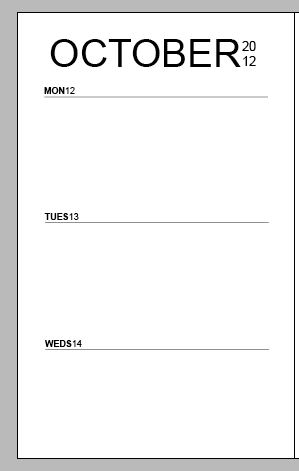

I still do not feel the diary has the designers feel required about it. This is still highly based on a standard diary format, so I want to take inspiration from some high end design layouts then apply the elements back into this. Work is still in progress!
Subscribe to:
Posts (Atom)