Using the data I gained from the taste tests I carried out, I plotted my results on an 8 spoke graph with each spoke representing a different factor.
I created a new layer for each profile. Once I had created 100 of these I then visualised them all, thus creating the image below.
I began looking at filling each profile with a transparent colour as I thought it may be visually appealing once they were all layered upon each other.
I noticed they had a black border around them which I was not fond of as I felt it was restricting the shape, so I removed it.
I much prefer this without the border, it makes it less on it's own. However, layered with the others I think it will create some interesting effects.
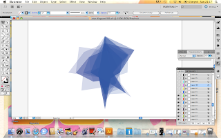
I began experimenting with layering up the profiles using different shades of blue, I quite like the effects. I am then going to overlay magenta and yellow on top of these.
After layering up all 100 I realised they were not creating the layered effect I desired due to me placing all similar colours together.
I changed the top few layers, this begun to look more like how i'd expected it to. I think a little more experimentation is in order.


No comments:
Post a Comment