I had decided I wanted to propose tees that the Boots staff members could wear in order to promote the 17 cosmetics range. These tees will work with the colour coded range of 17 cosmetics (this demonstrates the 'face' range but I will propose the other colours too).....
Sunday, 20 May 2012
In store presentation
I want the in store presentation to reflect the products and the identity of the brand I am trying to perceive, so I want the presentation to be clean, fresh and to the point. It will also reflect the packaging design that I am rolling out through the brand....
I want the products to be free standing on an island. The clean cut geometric blocks provide the basis of the structure and allow the presentation area to easily be altered depending on the products being presented.
I have placed products up on the structure to give an idea of what it will look like; obviously this uses the same product from each range where different products from within each range will be used normally.
I have positioned this on a sleek white table to reflect the design upon the products.
...I placed the logo upon this to make it obvious what the product brand is.
I want the products to be free standing on an island. The clean cut geometric blocks provide the basis of the structure and allow the presentation area to easily be altered depending on the products being presented.
I have placed products up on the structure to give an idea of what it will look like; obviously this uses the same product from each range where different products from within each range will be used normally.
I have positioned this on a sleek white table to reflect the design upon the products.
...I placed the logo upon this to make it obvious what the product brand is.
EXTENDING THE RANGE
As I am going to propose the range works for all the products, I want to demonstrate how this would look so I have shown how the nails range would be presented following the same structure....
...obviously each product would be different, but this just shows how it would work.
iPhone App Construction
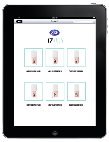
I have applied the same layout present upon the website and iPad app to this iPhone to demonstrate how this online application can also work across a mobile phone.
I was at first considering using the same structure as is presented upon the initial page you reach when accessing the app, however, this appear slightly too long and takes up too much space so I reverted to the structure I have previously used on the app and web page; keeping the visuals consistent across the devices too....
iPad app construction
Using the categories as buttons through which they can be selected and then taken through to the products where they can then be purchased.......
Saturday, 19 May 2012
Post-Crit: Responding to Feedback
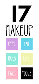
So, one suggestion mentioned to me in my crit was to try white type on the buttons...
I think this works well but it does make the legibility of the 'lips' button fairly low.
I thought I'd also try this with the 17 logo and put it in the same format as the buttons to allow it to work alongside them. This could become the button to take you back to the home page...
I think this works well but it does make the legibility of the 'lips' button fairly low.
I thought I'd also try this with the 17 logo and put it in the same format as the buttons to allow it to work alongside them. This could become the button to take you back to the home page...
New shopping bags
Using what I seen from my research I have decided to alter the application of the type; rather than having it aligned in a square, I have presented the type horizontally....
I have also applied a direct link to the Boots17 online webpage via a QR code. I will propose that the '17' will debossed and have a UV spot varnish applied to it; this will create a direct contrast to the 'makeup' type and highlight it's importance as the brand name.
Subscribe to:
Posts (Atom)