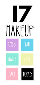
So, one suggestion mentioned to me in my crit was to try white type on the buttons...
I think this works well but it does make the legibility of the 'lips' button fairly low.
I thought I'd also try this with the 17 logo and put it in the same format as the buttons to allow it to work alongside them. This could become the button to take you back to the home page...


No comments:
Post a Comment