Wednesday, 29 February 2012
Paper Making
Today I have been researching into the process of paper making in order to allow us to gain an in-depth knowledge and an insight into the process so that we can then break this process down and play with how this is then applied to our designs. Unpicking the process down to the core elements, then photographing/scanning/capturing these images and reapplying them to our finished design ideas is a direction I am truly interested in testing out. Nevertheless, it is all well and good looking at secondary sources about this, but I feel that in order to gain a true feel for it we should do it ourselves! So tomorrow I am going to look into signing up for a paper-making session in college (as I know a couple of third years did this last year). I am also quite interested in going to a fabric dying workshop as this is quite closely linked (seen as paper is dyed too and Fedrigoni work with top fashion labels). This may well then give us scope for ideas on further direction to take our Fedrigoni brief, it will also provide us with these core skills and use of college facilities for next year.
Requestig Paper Samples
So I have decided to request some paper samples from a few different
paper stockists. Although we are not designing the actual swatch, I am
interested to see how other companies send their samples to clients as
this will give an indication as to the overall presence the company
possess within the design world.....
I have also emailed Lorenzo to see what advice he has to offer as this is the department he specialises in....
I have also emailed Lorenzo to see what advice he has to offer as this is the department he specialises in....
YCN Brief Ammendments
As we begun to re-think the problem of our brief, we slowly adapted the brief we wrote out last night...
YCN ...Concept Rationale Crit
So today we had our first group crit where we had to present our new concept rationale and re-written brief to two other pairs.
The feedback we received was fair and constructive but not very in-depth due to the sheer lack of information we had to present. Nevertheless, this has resulted in using seeing where we need to research in order for us to get some direction from our crit next week.
The feedback we received was fair and constructive but not very in-depth due to the sheer lack of information we had to present. Nevertheless, this has resulted in using seeing where we need to research in order for us to get some direction from our crit next week.
YCN Studio Workshop
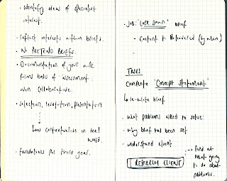
Today's workshop revolved around re-working our brief for Fedrigoni and our concept rationale we re-wrote last night. This proved to be a very challenging task! We thought that we had managed to define our problem yesterday, however, the questions Lorraine posed to use today when we asked her to look over our rationale produced some holes which we had overlooked. This meant that we were forced to re-work this and look at the problem again in order to produce a defined problem to which we can then build a solution upon. So, I sat down with pen, paper and the question 'WHY' in the forefront of my mind! I initially wrote down what we had perceived the problem to be, then questioned every statement I wrote with 'why' until I could go no further....
This has ultimately lead us to the root of the problem within Fedrigoni; the reason they have come to the students is due to the fact that Fedrigoni do not have a skilled in house graphics designer who can produce work which other graphics designers will appreciate in order to inspire them to use the papers within their next project. Consequently, our job as graphic designers is to produce work of a high quality that other graphic designers can relate to and appreciate. Other graphic designers need to be able to relate to these designs in order for them to be able to visualise how their own designs could work with the paper and potentially improve their overall design aesthetic. This is something which their competition GF Smith does extremely well; something which we, as designers, need to provide for Fedrigoni.
So, here is our to do list in order to now solve the problem......
8 Page Layout
Considering the hierarchy and page layout for an 8 page layout based on a graphic design article....
Tuesday, 28 February 2012
YCN: Ideas From Library Books
So today we took some library books out focusing on the topics of colour, fashion and paper craft. From flicking through the books I have been buzzing with ideas, so got a few of them down on ideas....
YCN ...Concept Rationale
Brief Title ......Fedrigoni
What is the problem?
Customers don’t order colour swatch books and they want people to order them
2. Fedrigoni need to promote their new ‘Imaginative Colour’ sample range so customers can begin to order it
3. Fedgrioni do not reach the UK design market; they do not have an active client group in the field of graphic design.
4. Strong competition from paper suppliers who already have cliental in the field of design. (i.e GF Smith)
5. Need establish themselves within the UK design industry (target up and coming designers)
We intend to (inform/ instruct/ persuade/ direct/ educate/ promote to)
Inform people of the new ‘Imaginative Colours’ sample range
Persuade people to use the ‘Imaginative Colours’ sample range
Educate people on how they have been used
Inspire people as to how they can use that papers
Promote the new colour range of papers
…a group of (identify your specific audience or context)
UK Design Industry; in particular graphic designers, top fashion labels and boutique publishing houses.
….that (state your message, idea or concept)
Deliver a product the UK design industry that make people aware that Fedrigioni ‘Imaginative Colours’ paper is available for them to use within their design work.
Concept: the design plays on the origins of the paper (how it is made and how the colour is applied)
In order to achieve this I will produce……..
(specify at this point in time what you aim to produce, the method of delivery/ distribution/ the context in which it will be viewed.)
A collection of print based media to showcase various ways in which the paper can be used to the designers advantage (inspire and promote)
This will be produced using …..
(state at least two print processes that you intend to use)
Screen print
Digital print
Although we are using the two most common methods of printing we aim to produce conceptualised artwork before, that plays on the origins of the paper itself, before it is then printed back onto the papers as promotional material which markets Fedrigoni’s products to the correct cliental.
YCN ...Re-Written Brief
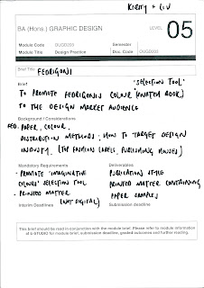
Brief Title: FEDRIGONI
Brief:
Collect,
catagorise and reflect on a body of investigative research in order to
produce a fully integrated advertising campaign which promotes the new
'Imaginative Colour' sample range by Fedrigoni. Background/ Considerations:
Work at a pace and continually re-evaluate designs in order to produce fully conceptualized work.
Work with a definitive concept/subject.
How can you break the brief?
Consider appropriate methods of distribution based on the audience.
Continually ask yourself WHY?
Are you being asked to produce work or propose work?
Produce appropriate deliverables.
Mandatory Requirements:
Fedrigioni logo can be blue, black or white.
UK strapline 'a place for paper'
Out packaging design ideas should be black to match Fedrigoni current design materials
Deliverables:
Printed design matter
Saturday, 25 February 2012
Friday, 24 February 2012
YCN ..Rewriting the brief
This was my first attempt at re-writing the brief....
This has been an extremely help process as it has made me realize where the holes are in my concept and where I know need to go and research.
As a result, I have begun to re-analyse the problem as I do not think we have it cracked just yet and we need to find the core of the problem in order to be able to resolve it. To do this I did a little brainstorming and wrote my thoughts down on paper........
I went around in circles a little bit there! I still don't think I have got to the bottom of it but I am a little closer now then I was earlier.
Thursday, 23 February 2012
Type Session 6
Presentation on a page as a process of communication
Tone relates to choice of font: bold/light versions of each.
Use margins to create space
Fit text to page...
Friendly
Two columns...
Creating a fun and friendly vibe using a skewed gutter....
Precious
Higher on page and more central....
Two columns...
...consider:
//gutters
//margins
//point size
//leading
ALWAYS USE PEN AND PAPER TO JOT DOWN IDEAS FIRST
A gutter should be in place so that you know to go down to the next line rather than across.
We want the gutter to be as small as possible to create as much white space as possible.
Minimum of 3 character widths.
Newspapers use thin rules down a gutter to make them as small as possible and guide reader down a column of text.
9pt justified ...4mm
9pt ranged left ...2/3mm (type heavy to the left creates the sense that the gutter is bigger)
Magazine layout...
Forgot the image SORT THE TEXT FIRST
3 x A4 page layout
1// for academic journal
2// for a Sunday supplement magazine
3// Magazine aimed a 16-21 (groovy!)
CONSIDER: point size, choice of font, alignment, audience/context
Wednesday, 22 February 2012
YCN
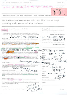
Although we were only supposed to have 3 briefs we liked the look of, we hadn't been able to decide so had 4 to choose from instead. We each looked at these, discussed ideas and annotated them with our thoughts on each of the briefs.
We then managed to refine these down to 2 we would like to work on and 1 we definitely wouldn't.
For each one we also noted down 5 reasons why they either did or didn't appeal to us as a collaborative team....
After having done this with each of the briefs, we thought about what it was within the briefs which made us like/dislike them....
This proved useful in narrowing down the two chosen briefs to one as we considered all the above points in relation to each of the briefs. In doing this we decided we wanted to work on the Fedrigoni brief. However, we needed to consider what it was that we wanted as an end product that will fit the brief as it is fairly open ended (although it has to be within print based media).
We created this table to analyse how open the brief was and took 5 words directly from the brief under each of the 4 headings....
In carrying out this task it got rid of all the mess and additional noise they supply with the brief; getting down to the core information which is vital that we consider. This will allow us to focus our designs and ensure we are designing to meet the briefs core requirements. We can then expand upon this in order to ensure our designs are cutting edge.
We then considered 5 things the brief asked us to do (taking quotes directly from the wording of the brief). This was fairly easy as they direct a fair bit of information as to what they want; although it is vague.
We then worked out 5 problems the brief asked us to solve. This proved a little harder as we didn't have information on the company or their competitors; there was a lot of researched that seemed necessary in order to complete this question. Consequently, we are going to research into the following points to allow us to answer this question fully....
It is important that we discover what the problem is that they want us to solve in order for us to solve it and create a piece of design that fulfills their needs as a company.
We have set ourselves a few initial tasks that seem necessary to complete in order to move forward, however, there will inevitably be other tasks which arise and become necessary to complete as we progress.
Subscribe to:
Comments (Atom)


