1. What skills have you developed through this module and how effectively do you think you have applied them?
Through this module I have learnt to listen to what is said to me in my crits and act upon it. I have found that through this module my crits have been vital to my progress; I used to see them purely as a knock down but I think this module, more so than any other, I have learnt to use the feedback constructively to enhance my work. In the type and grid sessions I have learnt about how to use a grid correctly and consider format. This has had a dramatic effect on me, as when I now view any kind of graphic design in the environment, both good and bad, my eye seems drawn to the layout! I have also learnt how to use the programme InDesign, so am now able to produce double page spreads or a booklet. Finally, our group project has taught me that not everyone will always pull the same weight within the group and you have to deal with this accordingly; everyone will take credit for the end result!
2. What approaches to/methods of research have you developed and how have they informed your design development process?
In order to generate an array of ideas is important to have a broard range of research; both primary/secondary and quantiative/qualitative. The more primary research, the better! Through this module it has become apparent that the more primary research you can gather the more ‘live’ and ‘real’ your work will become; it begins to target actual problems rather than thinking hypothetically.
3. What strengths can you identify in your work and how have/will you capitalise on these?
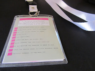
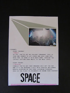
I am pleased that I took the time to produce and hand rendered product for the ‘Speaking from Experience’ brief and broke away from the standard digitally manipulated work I have produced for other briefs. This is also true to our group project ‘Communication as a Virus.’ We so nearly fell into the trap of re-designing book covers, however, our thoughts then empowered us and we decided to have some fun with it, got ourselves out into the environment and created visual communication in a completely different manor; flour!
4. What weaknesses can you identify in your work and how will you address these more fully?
I feel I have begun to ponder too much before beginning to design, again; I need to get stuck into designing straight away, let the problems arise and deal with accordingly rather than thinking ‘what if’ all the time. I also feel I still need to fully consider what the brief is asking of us. This is particularly true to the live type brief we entered our work into; it wasn’t until my crit that it was pointed out to me the fact that it was indeed a type based brief and therefore our work should have a strong type driven aspect within it, something mine did not have. In our group project ‘Communication as a Virus’ some people within the group did not work as hard as others, this inevitably resulted in some people working harder than others but everyone taking the credit for it. To ensure this does not happen in future I think a stronger task allocation could help make all members more coherent.
5. Identify five things that you will do differently next time and what do you expect to gain from doing these?
- Read the brief fully and consider what is being asked of us and what is relevant to produce, before delving into designing.
- Once I have a concept and some rough designs, get on with it!
- Produce regular time plans for the week to keep me on track time management wise.
- Collect more primary research to enhance the relevance of my work.
- Stonger task allocation in group projects to ensure everyone pulls their weight.
6.How would you grade yourself on the following areas:
Attendance -5
Punctuality -5
Motivation -3
Commitment -4
Quantity of Work Produced -3
Quality of Work Produced -3
Contribution to the group -4


