

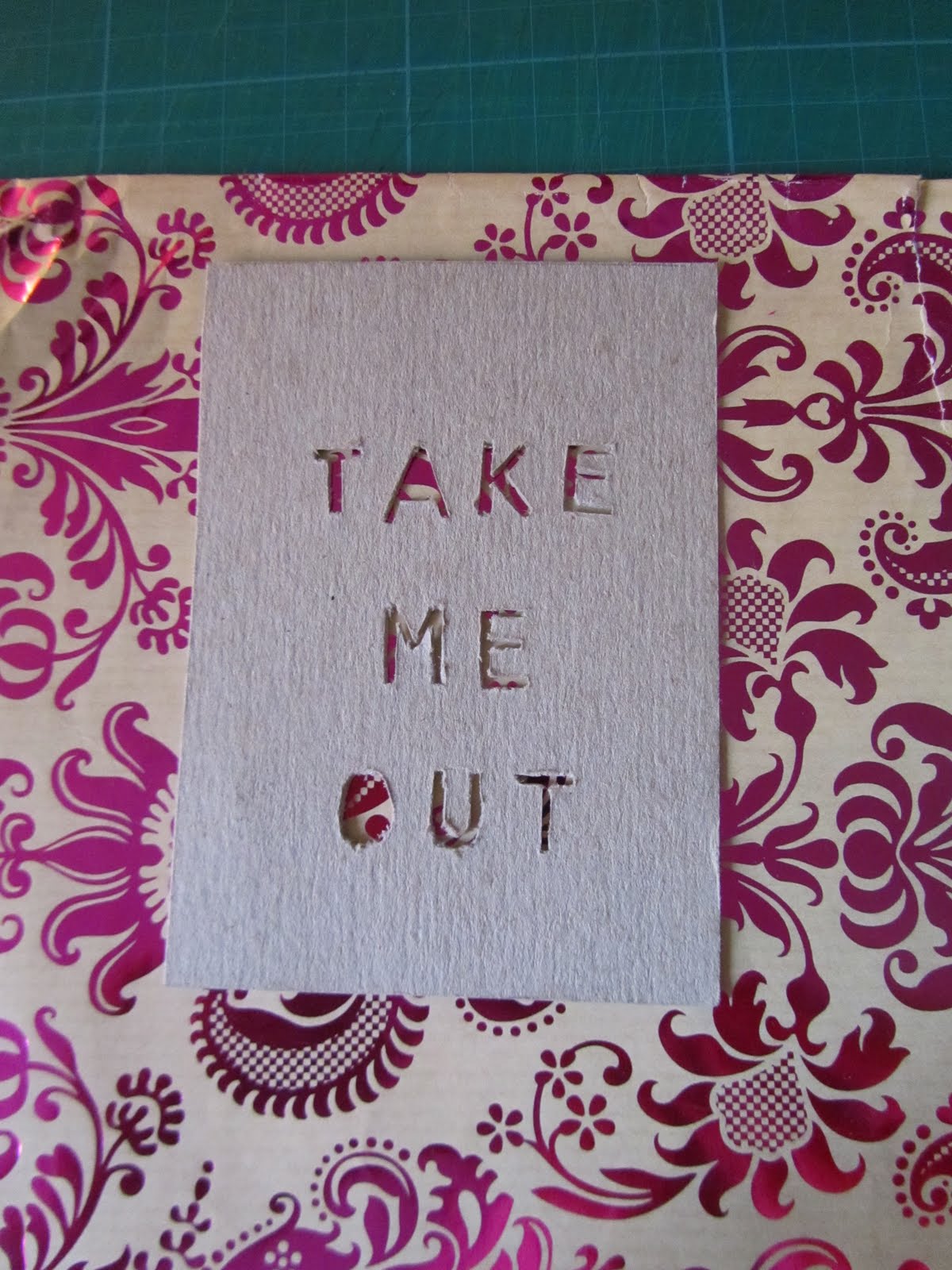
I attempted to cut the letters out of foam to begin with, however, I soon found that it didn't cut clean at all. I do like the positives that were produced though!


Placing a vibrant colour behind enhanced it's legibility.


I used this reversed type stuck onto the rear of the media I was working with to ensure consistency within the lettering.


The outcome of using the grey chipboard was a lot cleaner than the foam, however, it could still do with being a little tidier.


Taking inspiration from the Evo Catalog, I have used geometric shapes to enhance the appearance of my guide and infuse a little colour.


I wanted to incorporate both digital and handmade elements into the cards to highlight the fact that just because you are on a graphics course it does not mean to say that all the work you produce should be digitalised, it can be hand rendered. This is a trap which I fell into ....as soon as I got a brief i'd be straight onto the ol'mac!! Amber brought this up in my tutorial and suggested mixing it up a bit, so in doing this hopefully I can also portray this fact to the first years too.
No comments:
Post a Comment