Friday 28 January 2011

Visually Representing Data.

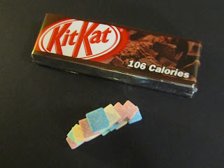
I began to consider how I could visually represent the data and statistics in an alternative manor to digitally based work I usually produce. I stacked the cubed sweets to represent the amount of sugar in the KitKat and also for the amount of fat, sugar, calories and saturates.


I also experimented in doing this with some of their flavours.....


From the KitKat flavours I researched I then produced these.....

Peanut Butter KitKat


Herbal Tea KitKat (available in Japan)


I really like this style of working as I think it engages with the audience considerably well. However, I would need to consider how the information would be easily conveyed to my audience if I were to use this.

Sweet Blocks.

Colour is an extremely important factor in the packaging of sweets, as it is that what can sell the product. I took the colours of these sweet packets to the bare minimum; coloured blocks. 


I found this process really quite interesting and the results aren't bad either. 
Through doing this, I also found that many sweets use brightly coloured packaging; an aspect which I could incorporate into my work somehow.

KitKat Text Translation.


I used a coding system whereby each letter of the alphabet has been replaced by an individually coloured block. I have then used this to code the wrapper of a KitKat. I think the visual outcome of this technique is remarkable, it also engages with the audience considerably well as they are required to use the system to decode the information ...interaction right there!

Thursday 27 January 2011

Video Workshop2.

I wanted to use my 100 sweet sensory taste test profiles I had created.
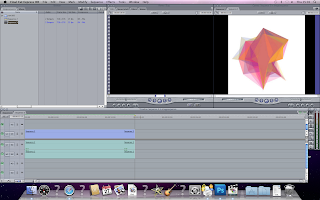
I imported my 100 images into FinalCut.


I adjusted the speed of this to 00:00:00:60


Untitled from Kirsty Fruin on Vimeo.


I thought this would look better sped up, so I adjusted the speed to 00:00:00:40.


Untitled from Kirsty Fruin on Vimeo.


We then looked at inserting text into the video......


I chose to have pink text which would be displayed only at the beginning of the video until the images appeared.


Untitled from Kirsty Fruin on Vimeo.


I then experimented a little, keeping the text the same, I changed the colour and kept it visible throughout the whole video.


Untitled from Kirsty Fruin on Vimeo.


I then experimented with incorporating sound into my video.

Stacked Column Graphs.

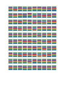
I input the data from my sensory taste tests and produced the following stack and bar charts.


I input the data from my taste tests into Numbers on iWorks. I thought these could look quite intriguing if I were to use only the stack, so I cropped them out and positioned them together.

I thought these may look better closer together, so I played around with the spacing....

&in my opinion...yes they do!

Tuesday 25 January 2011

Experimentation with my infographics.

After producing my infographics based on the sweet taste tests I wanted to push this idea further, so began experimenting......


I really like the different coloured lines mapping out each shape when you rolled over the image, so I began manipulating the lines on the individual profiles.


I experimented with the stroke and colour to create this.


I incorporated shape onto the line.


I then thought it could be quite visually interesting if I were to used different coloured dots to pin-point the edges of each profile. However, in carrying this out I soon found that many of the colours overlapped due to them all being plotted using the same graph. This meant there could only be spots in 40 different places and this would just create the star shape they were plotted on with spots. So this was a write off! 

Creative Books&Paper Folding.


My word I had to express was HAPPY! ...I found an image of girl looking extremely happy on one of the later pages&decided to cut into the book, allowing only her face to be visible.


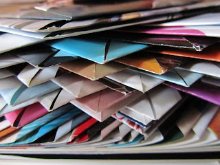
However, I soon found cutting circles extremely tedious and decided to experiment with the effects of paper folds instead; with the intention of creating another piece of 'Book Art' using these techniques.


I broke the book down into sections and used the same fold within these. I think if I use one of these sections of folds throughout the whole book the results could be stunning! 
Also, I have noticed that it seems to be the colouring which becomes visible that really makes the books come alive!!