Rihanna&Drake...
'the square root of 69 is 8 somethin', right?
....could be the line for my title?!!

Saturday 26 February 2011
Thursday 24 February 2011
Print Development2.
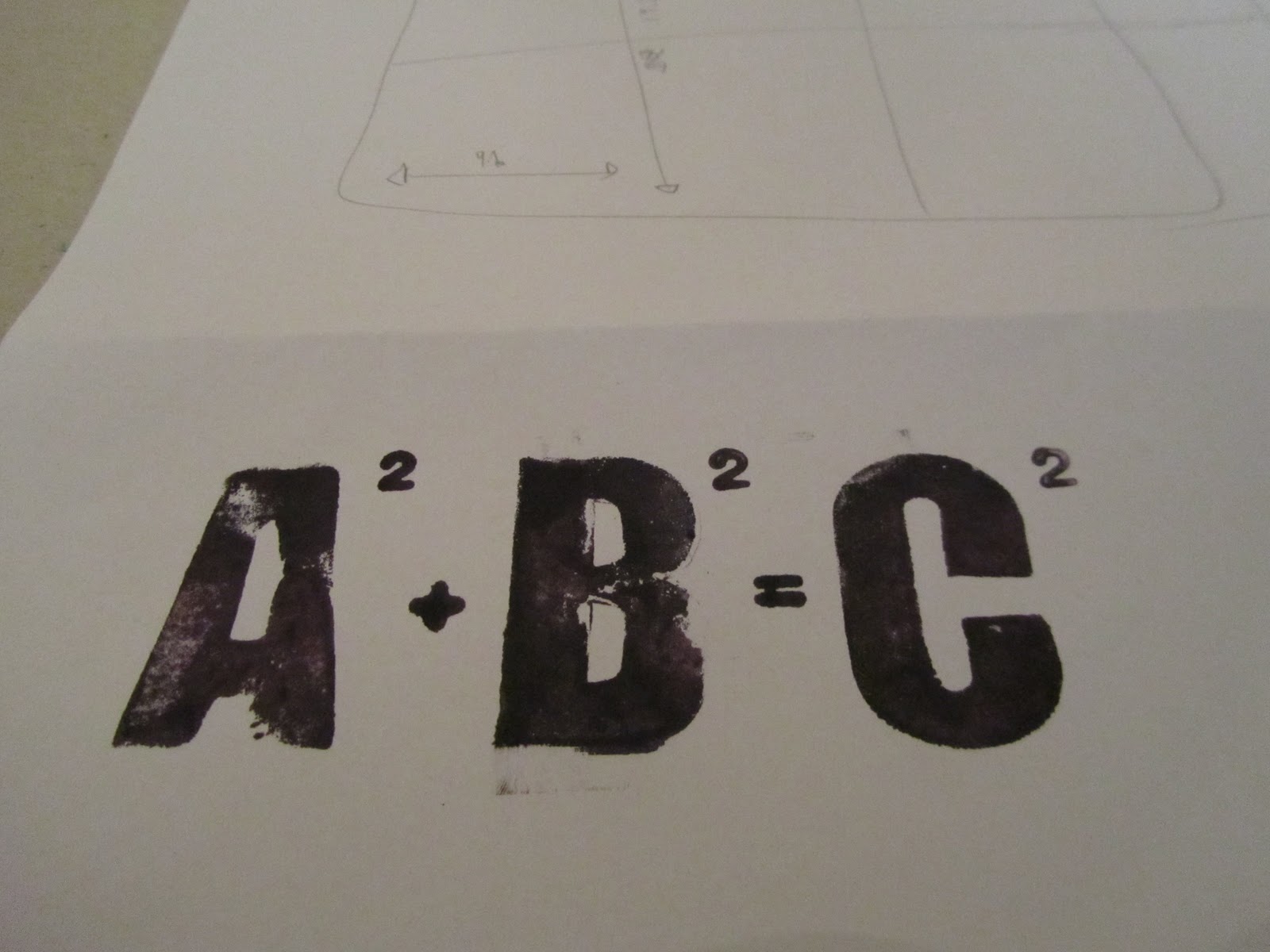
I used the foam letters to print this equation ...I like the boldness of it.

I then printed it onto my mock design ...I really like it and think it works well as a whole design.

This is the design in which was cut down to ensure the grid fits into the centre square. However, when I then went to print the equation onto it, I found that it didn't fit within this. I really like it, nevertheless, it is a little small!

I decided to use the larger design and print the equation using the foam letters and stamp set so set about printing 5 grey on stock and 5 cream on stock....


As the equation I have used relates indirectly to a square, I thought a play on words as the title would be quite fitting. Using square in the sense of 'peculiar'??
Or simply... 'a square in math' or 'square math' could work.
Hmmmm.
Wednesday 23 February 2011


Monday 21 February 2011
Print Development.

I used my embossing labelmaker to make these little tags, they seemed to fit the theme immensely well.


Again, I experimented with the layout. However, I found there was still a lot of empty space due to the small scale of the labels.

I considered making my 'book' a square when it was folded down.

This seemed a great idea, nevertheless, when folded out the size of the paper was not conventional.


However, I thought i'd see how it looked using one of my printed designs.

My desgn fitted considerably well across the width ...it's just the space above and below which need a little thought.


Using a small label on the front would look crisp.

I wasn't sure whether to keep the design as a poster of use the 'hotdog' fold to allow my design to become a book.

What to title it??


I decided to try writing the text out using the stamp set.


Playing with the positioning of the front label, taking into consideration the band which will encase my 'book'.......


I think positioning the label in the bottom right hand corner works best with the band.


I measured the text to allow me to centre align it next time I print it.

My design almost fits into the centre square with the exception of the grid. I was thinking I could attempt to create a design whereby it opens out into this square design. Hmmmm.
Saturday 19 February 2011
Screenprint Development.
I needed to incorporate type into my design so I got my thinking cap on...

I purchased these foam letters as I thought I could use ink or paint to print them (I was home for the week so couldn't use print resources to letterpress or screen print)

I experimented with the layout and just had to envisage it printed in black.


I had a small stamp set which I thought would suit this design a treat.


I also considered using the stamp set for all the text.

Subscribe to:
Posts (Atom)