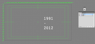
I have mainly used the layout; the position of type and the use of lines to then convey my own message to my audience....
This is the original plan for the composition of my title sequence artwork. I think I want to then place the logo in the top left hand corner (although I am not 100% sure on this and the black triangle). All the layers of type are visible at the moment. However, each piece of type is on a separate layer to allow each piece of type to be individually transformed in AfterEffects. This will be placed upon a gradient to enhance the MoS vibe.
I think could look effective if the right transitions are applied and remain in time to the beat of the audio.
I then realised that it will be easier if each piece of text is presented in a different composition (to make my main composition less cluttered and more organised) so I set about positioning the artwork in separate documents with each piece of type on a separate layer....
...I put the ministry of sound type with each letter on a separate layer as it is going to be necessary in order to produce some of the effects I have storyboarded for my title sequence.
...now to get these into AfterEffects and get moving these graphics.


No comments:
Post a Comment