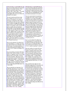
My attempt at fitting text into a single column.
Use:
//Point size
//Leading
Reduce point size by one and make fit
PRINT IT OUT and have a look.
As a group, after printing out the sheet, we have chosen column number 3.
Talk about type size as the relationship between the point size and leading (ex// 7.7 on 18.4)
Standard on inDesign is 12/automatic (as a number).
Number 1: has automatic leading yet none of us chose that column ...the additional leading makes it easier to read.
Number 4: doesn't look like a body of text ...too spaced out.
To control how well fill a space we can also change the type of font used. Different fonts have different 'X' heights because its a bigger height of a font will fill the page differently.
Small 'x' height font... Benbo
Big 'X' height font... Arial.
Small 'x' height appears to have more leading.
Big 'X' height appears to have less leading, fills the space available in 12pt.
NEVER use negative leading.
Use one typeface so you gain knowledge of how it works within different spaces and how you can apply it to different publications.
10pt type has automatic leading of 12pt
12pt type has automatic leading of 14pt ...etc
Column Width
Fitting text across 1, 2, 3 and 4 columns.
Third column is easiest to read.
First column too narrow.
Second column too narrow ...won't read a column of 3/4 words long.
Minimun number of words in a line is 6 ...36 characters on a line.
Slightly shorter on a tabloid newspaper than a broadsheet. Tabloid use shorter words than a broadsheet (longer more educational words) so more words on a line.
Book 11/12 words long.
NEVER less than 6 ...NEVER more than 12.
Point size
Readability...
magazine 10pt/8pt
book 12pt
correct point size for reading text for the whole community ...14pt
consider who target audience and publication type in relation to how big a point size you use.
2 Paragraphs
A paragraph is a change of subject.
Testing typefaces to see how they use the space.
To make the type bigger on the page but remain on the page:
//decrease leading, increase point size
//remove the spaces
and increase point size to fill column
Choose first one. Paragraph breaks make it easier to read ...line spaces.
Cannot see paragraph breaks in the second. Can indent or line space.
NEVER use both.
A tab space is a cm (three characters). It allows even spacing across the page.
Shortest word at the end of a paragraph is three characters.
Never finishes with one letter.
Fitting the image in a big as possible.
Firstly, should consider the type ...create as much space on the page as possible. Small but readable.
Remove space and indent.
Ensure clear geometrical relationship between elements on a page.
Create space on page to be creative with. It's inviting. Makes it seem like the article isn't very long.
All above are techniques for creating space for writing.
Alignment
Justified: word spacing ...same size space between every word space.
(novels)
problem...speeds and slows down line ...creates unevenness.
Creates a shorter column length.
Ragged left or aligned right
Ragged right or aligned left
Centre alignment ..used in poems to slow people down (gives people room to consider)
START CREATING OWN TYPE SCRAPBOOK.


No comments:
Post a Comment