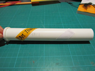
I obviously need to consider the stock I use as I am experimenting with standard printer paper here, which is of a low GSM. Nevertheless, this process of experimentation is providing me with knowledge of how certain print finishes may work with my design. I can then expand upon this; ensuring I choose the correct stock and apply my design to the product in the correct manor.
Creating a UV varnish on the black type only. This will then contrast with the uncoated yellow stock to produce a shine.
Applying an elasticated band to a book will alter the application of my design as you have to take into consideration the positioning of the band in relation to the design.
Creating a UV spot varnish on only the coloured section of the label. This will contrast with the uncoated stock which contains the type.
Considering packaging the pencil and notepad together. This is obviously a very cheap way of doing this, I think a better solution could be had if I were to consider the print processes in a more creative manner.
..applying the logo design to the pen/pencil combo packaging.
Here, I have tried to UV varnish around the type as to leave the type uncoated. I think this could work considerably well as I have done so here as the whole block of orange is a direct contrast to the uncoated white, it is this contrast that gives the UV varnish its value. It could also work reversed out, applying UV varnishing the type only.
UV coating the whole block of orange is another option.
Applying this design to a product.
Investigation into how this design can interact with the cylindrical container.
...wrap around the top or bottom. This creates a lot of empty space, but given the right stock is used this could be quite effective. A clear/translucent structure may work well.
I like the way you can see the pencils through this packaging.
Wrapping the design over the edge to create a seal is a way in which you ensure your pencils are 'fresh'
Considering the use of a different stock. I thought a smooth UV varnished colour spot contrasting against the rough texture of the board would look effective.
Creating a UV varnish....black on black for the type and a UV block of colour works very well too.
I also wanted to see the effect of this on white stock...
it creates a very subtle mark on the page, which can be effective but is not ideal for providing information my audience in the way that I am.


No comments:
Post a Comment